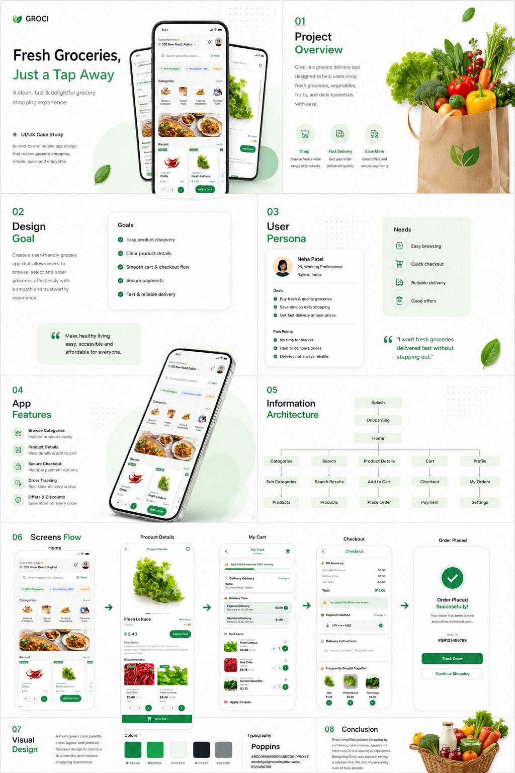
Shoppers abandoned grocery carts due to promotional banner clutter, unclear unit pricing, and surprise delivery fees during final checkout.
A streamlined mobile grocery redesign prioritizing clean category discovery, transparent per-unit pricing ($/kg), and upfront delivery slot fee selection.
In usability testing with 5 shoppers, all 5 completed checkout smoothly once delivery fees were shown upfront in the cart.
Project Overview & Context
GROCI transforms quick-commerce grocery shopping by removing promotional noise and providing complete price transparency from product search to final checkout.
Heuristic evaluation of existing app, user pain-point synthesis, category taxonomy redesign, before/after screen iterations, and usability testing.
The Problem & Core Friction
Busy urban households ordering weekly groceries online.
Shoppers experienced high cognitive fatigue and dropped off at checkout when unexpected delivery charges appeared.
The original application prioritized aggressive promotional banner carousels over quick product search and clear unit price comparisons.
Decreased conversion rates, low customer retention, and negative reviews regarding fee transparency.
Research Methodology & Discovery
Identify drop-off triggers in the existing shopping flow and evaluate price perception during item selection.
Heuristic evaluation & 5 contextual usability audit sessions on the legacy application.
5 frequent online grocery shoppers.
Usability testing evaluated mobile web/app flows; store pickup operations were excluded.
Why do users abandon their carts at the final payment step?
How do shoppers compare values across different package weights?
What hinders fast re-ordering of daily household staples?
Evidence Synthesis & Key Findings
01. Promotional Banner Fatigue
Auto-sliding ad banners covered 40% of the home screen, obscuring core category entry points.
Replace promotional carousels with a clean, structured category grid.
02. Unit Price Ambiguity
Users struggled to determine whether a 500g package was more cost-effective than a 1kg option.
Display standardized per-unit pricing ($/kg, $/lb) directly beneath item prices.
03. Surprise Delivery Slot Fees
Fee additions at the final payment screen caused immediate cart abandonment.
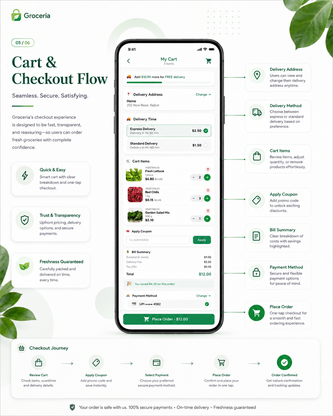
Integrate delivery slot and fee selection upfront inside the cart drawer before checkout.
User Flow & Decision Architecture
Search for daily groceries, compare unit values, select delivery slot, and complete 1-tap checkout.
Clean Home Category Grid / Search Bar.
Order confirmed + live delivery tracking active.
Design Decisions & Interface Solutions
Before vs After: Category Grid Overload Removal
Original home screen buried grocery items under 3 layers of marketing banners.
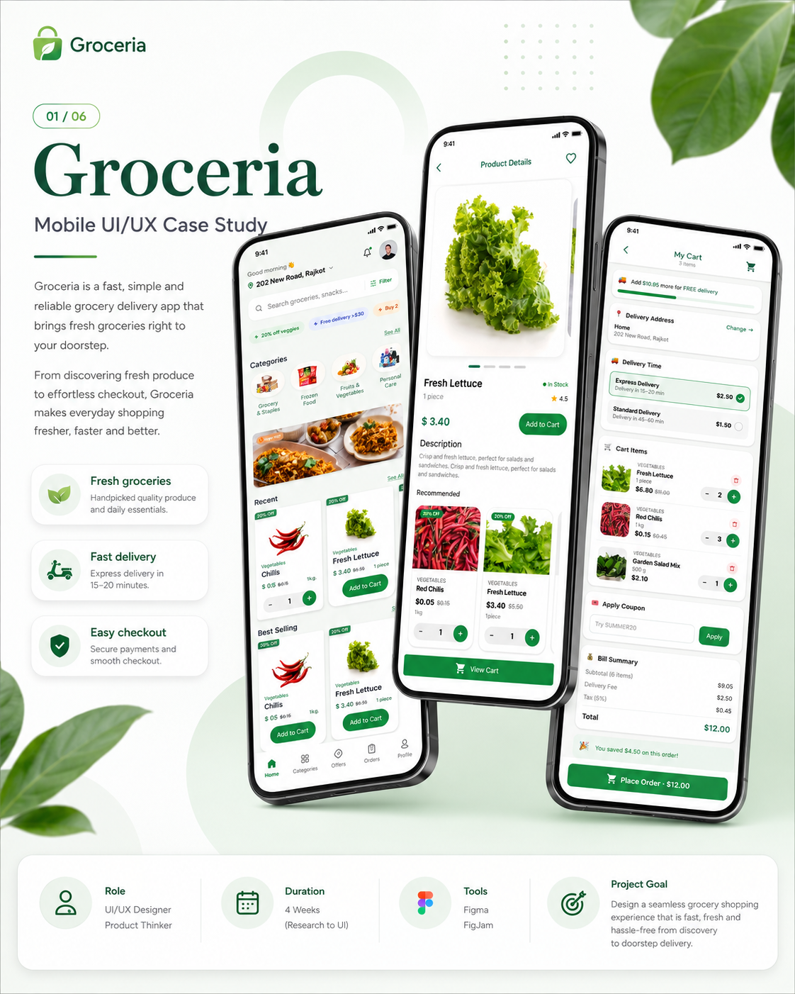
Redesigned home feed around a clean 4-column category grid with instant search.
Standardized Per-Unit Pricing ($/kg)
Customers want value transparency when adding items to cart.
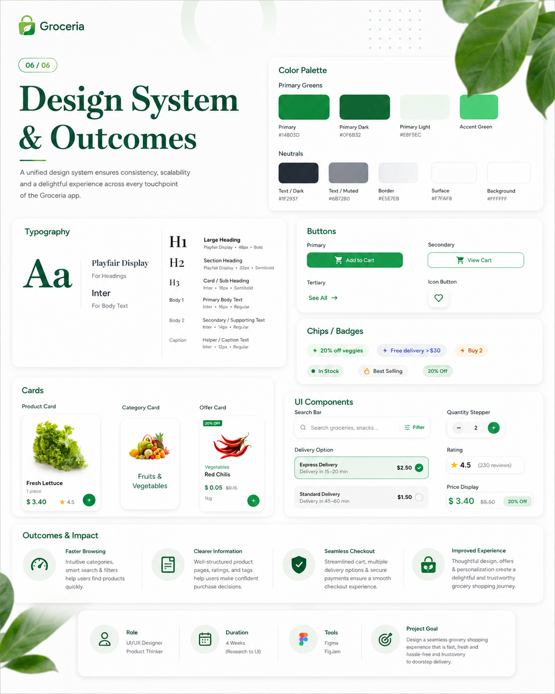
Added bold per-unit price badges ($/kg, $/lb) on all product listing cards.
Upfront Cart Slot & Fee Selector
Surprise fees at checkout break user trust.
Moved delivery slot selection and clear delivery fee indicators directly into the cart summary view.
High-Fidelity Interface Showcase
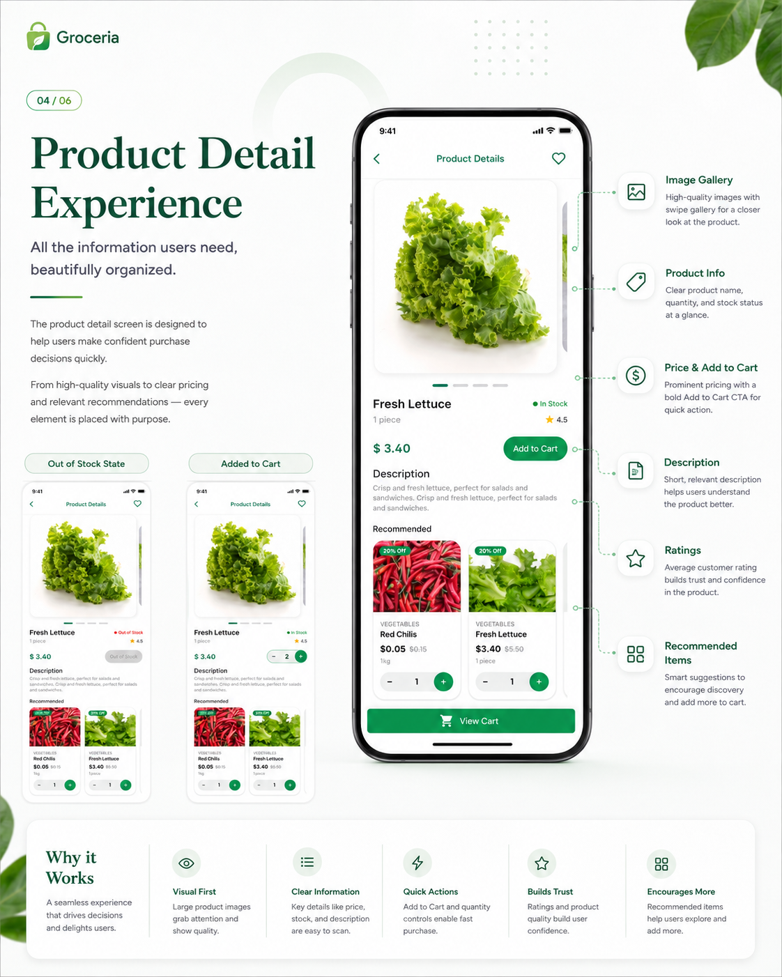
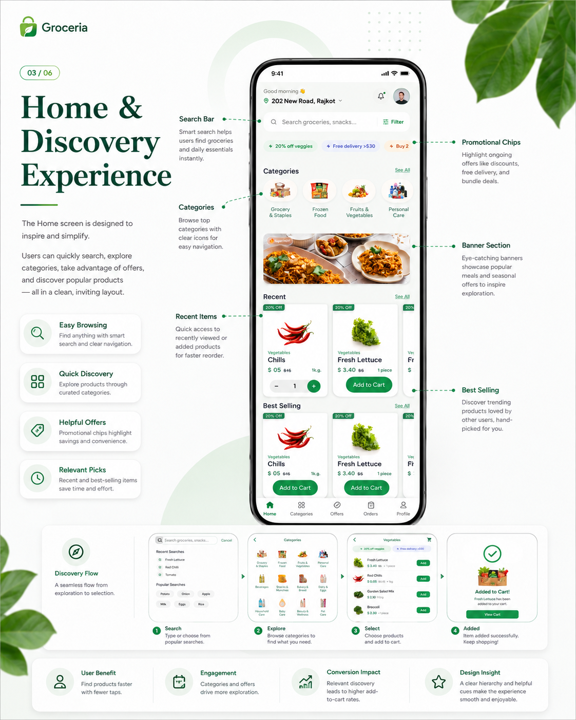
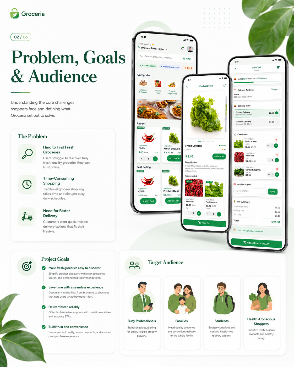
Usability Validation & Iteration
5 usability test participants
Small-sample usability test (n=5): before redesign, 3 of 5 participants complained of unexpected fees at checkout; after redesign, 0 encountered fee friction. Concept project with no production conversion data.
Before redesign, 3 out of 5 users complained about surprise fees at payment. After redesign, 0 reported fee friction.
Streamlined the payment step to a single confirmation swipe after slot selection.
Outcome, Learnings & Next Steps
Demonstrated how upfront fee transparency and clean category hierarchy reduce checkout drop-off in small-sample user testing. Concept project without live production telemetry.
Removing dark patterns and promotional clutter builds long-term user trust and improves conversion metrics.
Explore smart auto-replenishment subscriptions for weekly staples.