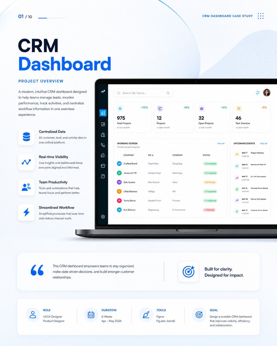
Sales teams lose track of deal status and revenue forecasts due to cluttered data layouts and slow multi-step record navigation.
A high-density sales pipeline dashboard featuring customizable modular widgets, drag-and-drop Kanban tracking, and quick slide-over inspection drawers.
In usability testing with 5 sales professionals, all 5 completed pipeline stage updates faster using drag-and-drop than the legacy multi-click modal flow.
Project Overview & Context
Redesigning the enterprise CRM interface to reduce cognitive clutter, streamline sales velocity, and provide clear executive revenue visibility.
UX audit, information architecture reorganization, component system creation, accessibility color token audit, and high-density dashboard layouts.
The Problem & Core Friction
B2B Sales Account Executives and Sales Operations Managers.
Sales representatives spent up to 2 hours daily manually updating deal records across buried navigation tabs.
Existing CRM systems prioritized database depth over user workflow efficiency, creating friction during fast-paced sales calls.
Resulted in stale pipeline data, inaccurate quarterly forecasting, and low CRM adoption rates among sales teams.
Research Methodology & Discovery
Evaluate daily sales workflow bottlenecks and identify high-frequency record update actions.
Product workflow audit, competitive CRM analysis, and 5 contextual user sessions.
5 B2B Account Executives and Sales Leads.
Focused primarily on B2B SaaS deal pipelines; complex multi-currency retail sales cycles were secondary.
Which metrics do sales representatives check first every morning?
What causes friction during stage progression updates?
How do managers monitor deal velocity and team quotas?
Evidence Synthesis & Key Findings
01. Visual Metric Priority
Sales reps needed quick access to Monthly Recurring Revenue (MRR) and urgent task items above all secondary reports.
Position KPI summary cards prominently at the top with customizable widget toggles.
02. Stage Transition Friction
Moving a deal from 'Qualified' to 'Proposal Sent' took 4 separate clicks inside nested modal screens.
Design a visual Kanban pipeline supporting direct drag-and-drop stage updates.
03. Context Switching Inefficiency
Opening full lead detail pages caused users to lose their place in the pipeline grid.
Introduce slide-over drawer panels for instant lead inspection without full page reload.
User Flow & Decision Architecture
Review daily sales pipeline, update deal stages, and check revenue forecasts.
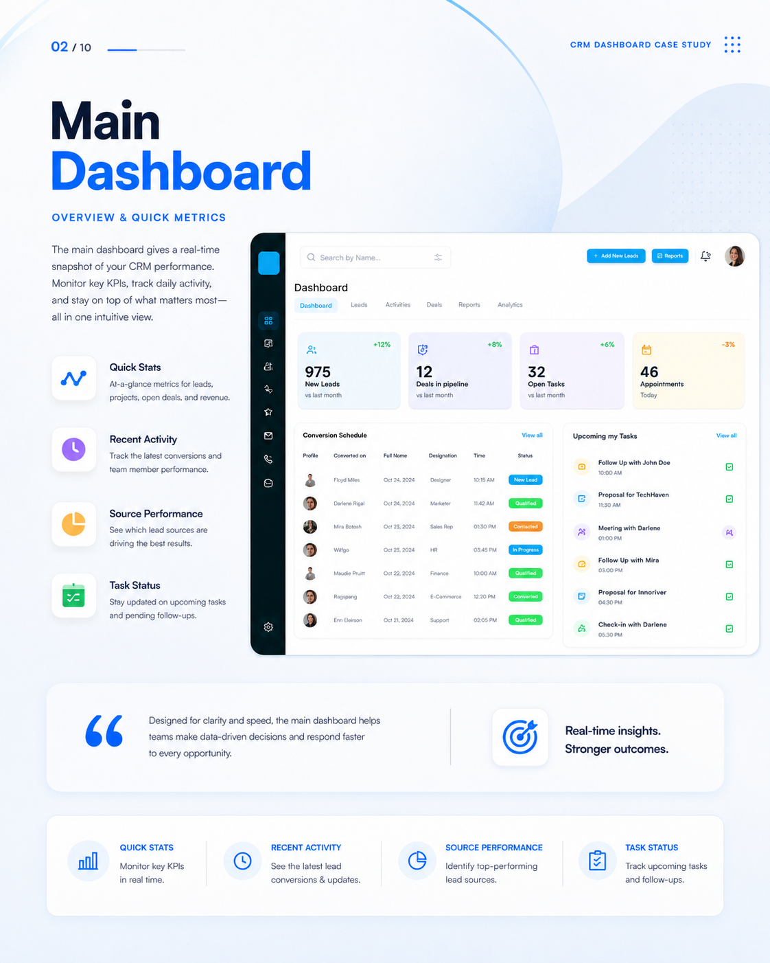
Main Sales Dashboard Overview.
Pipeline updated + automated task reminder set.
Design Decisions & Interface Solutions
High-Density Drag-and-Drop Kanban Board
Sales reps think visually about deal progression.
Built a responsive Kanban view with custom card status badges and real-time deal total calculation.
Slide-Over Lead Details & Activity Log
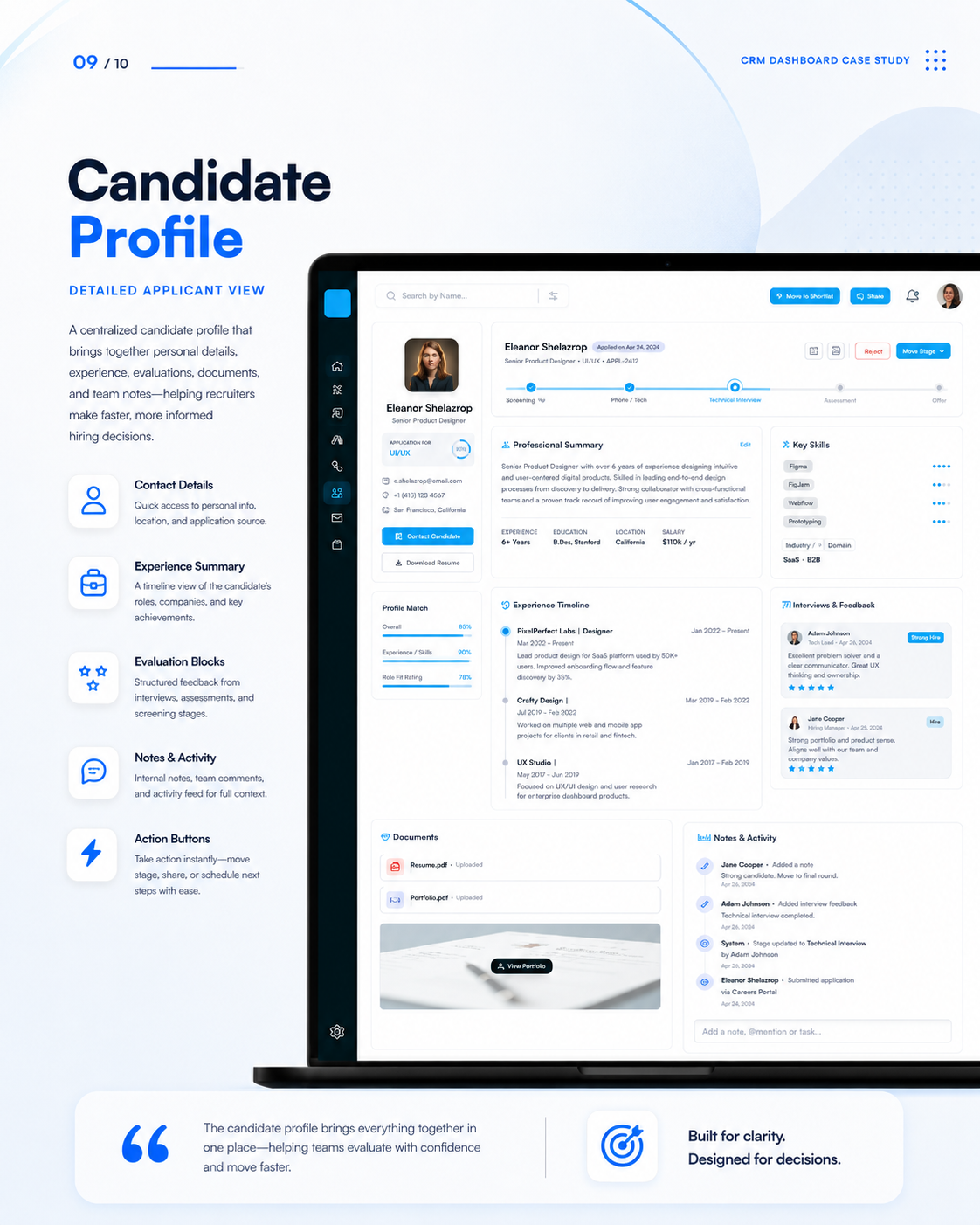
Full-page navigation broke the user's focus during quick updates.
Implemented quick slide-over panels for instant record editing and activity logging.
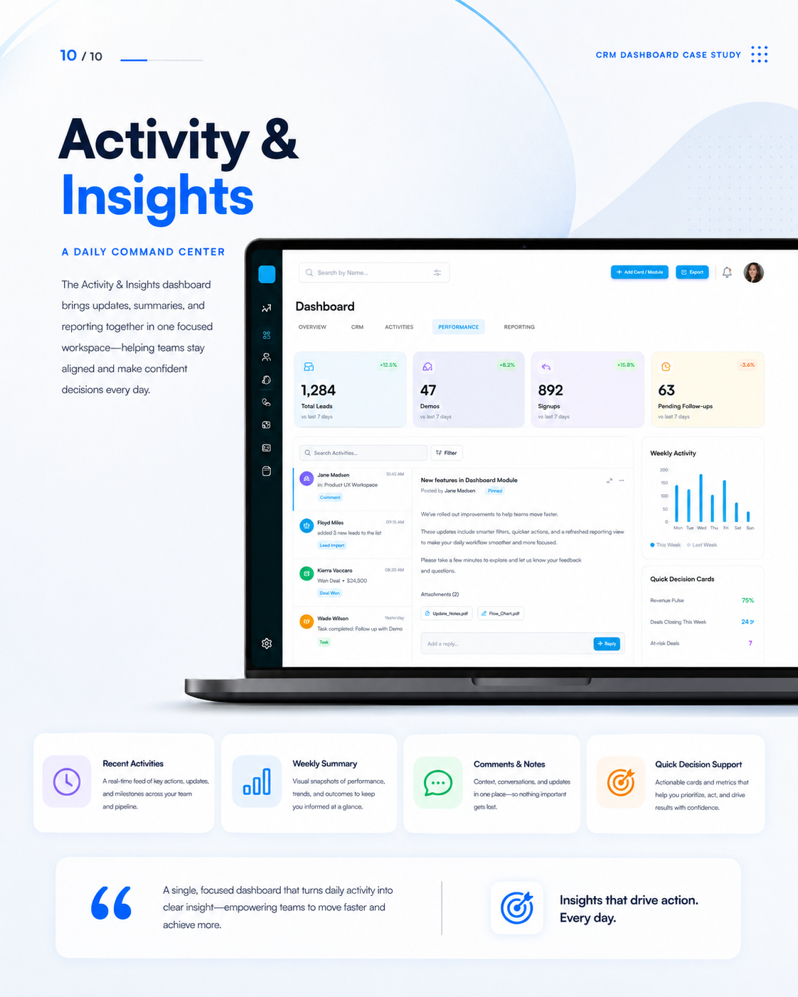
High-Fidelity Interface Showcase
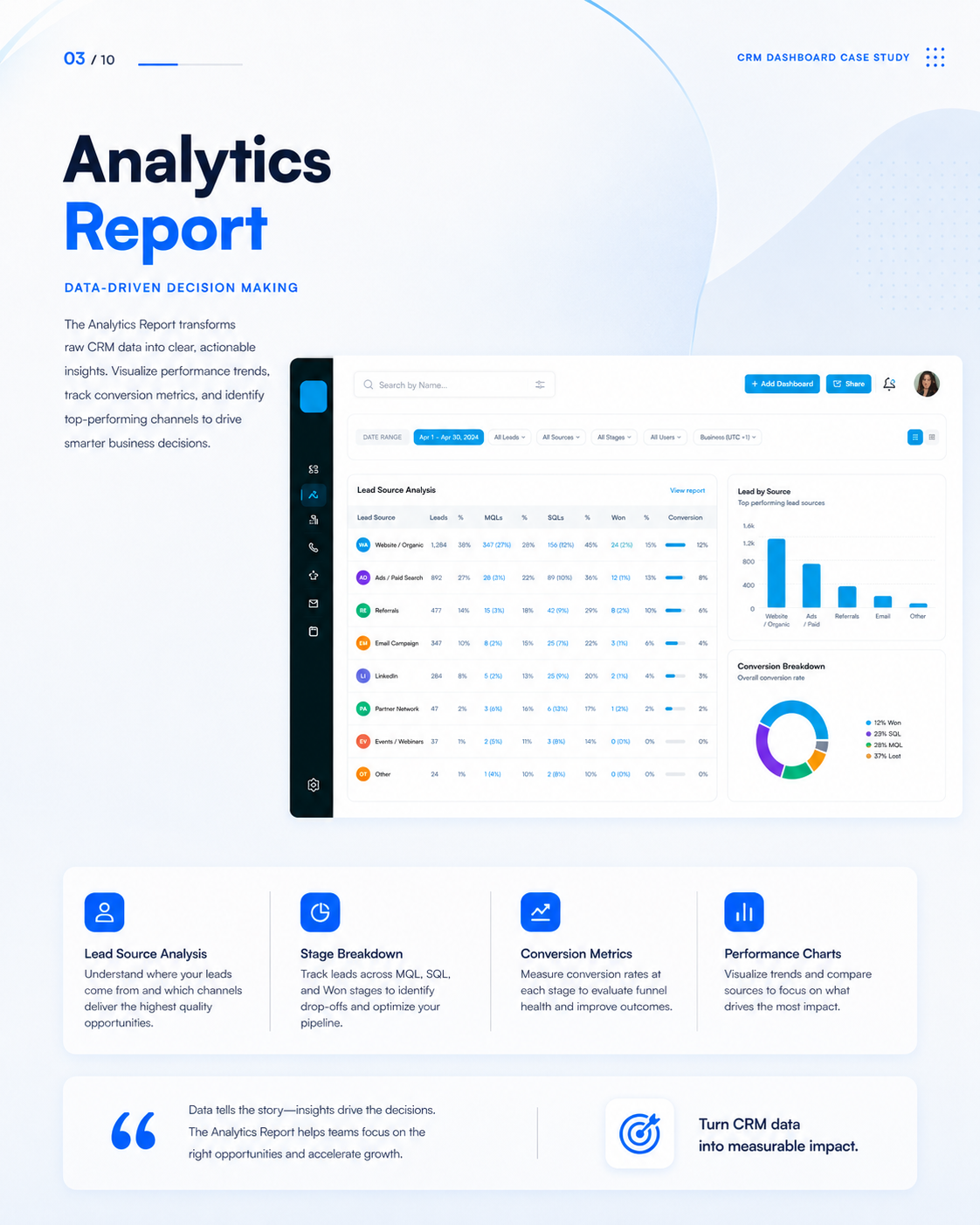
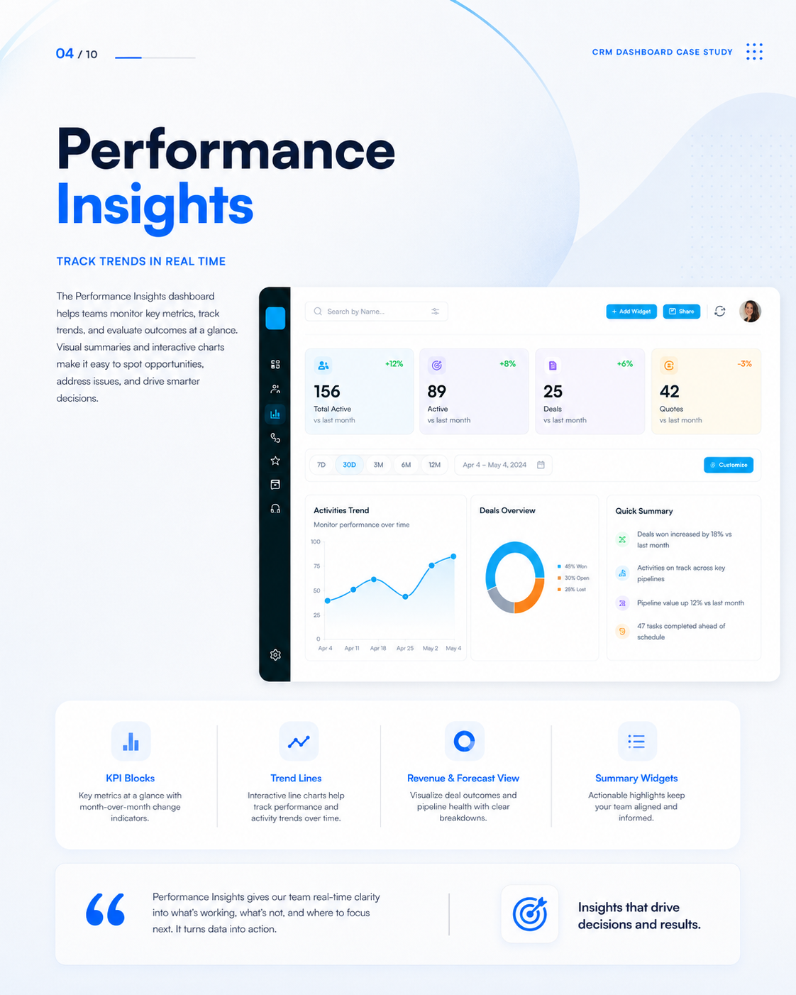
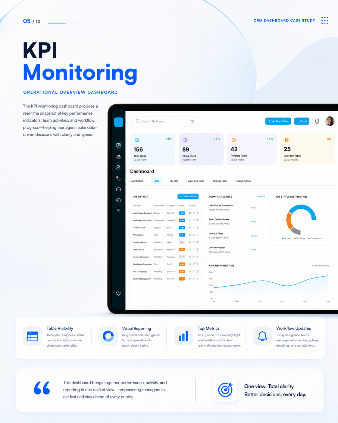
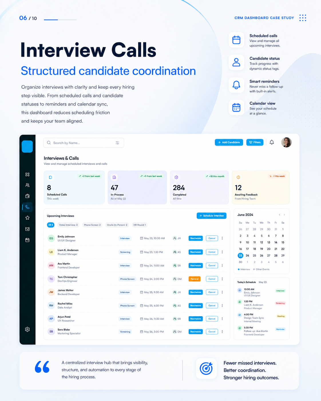
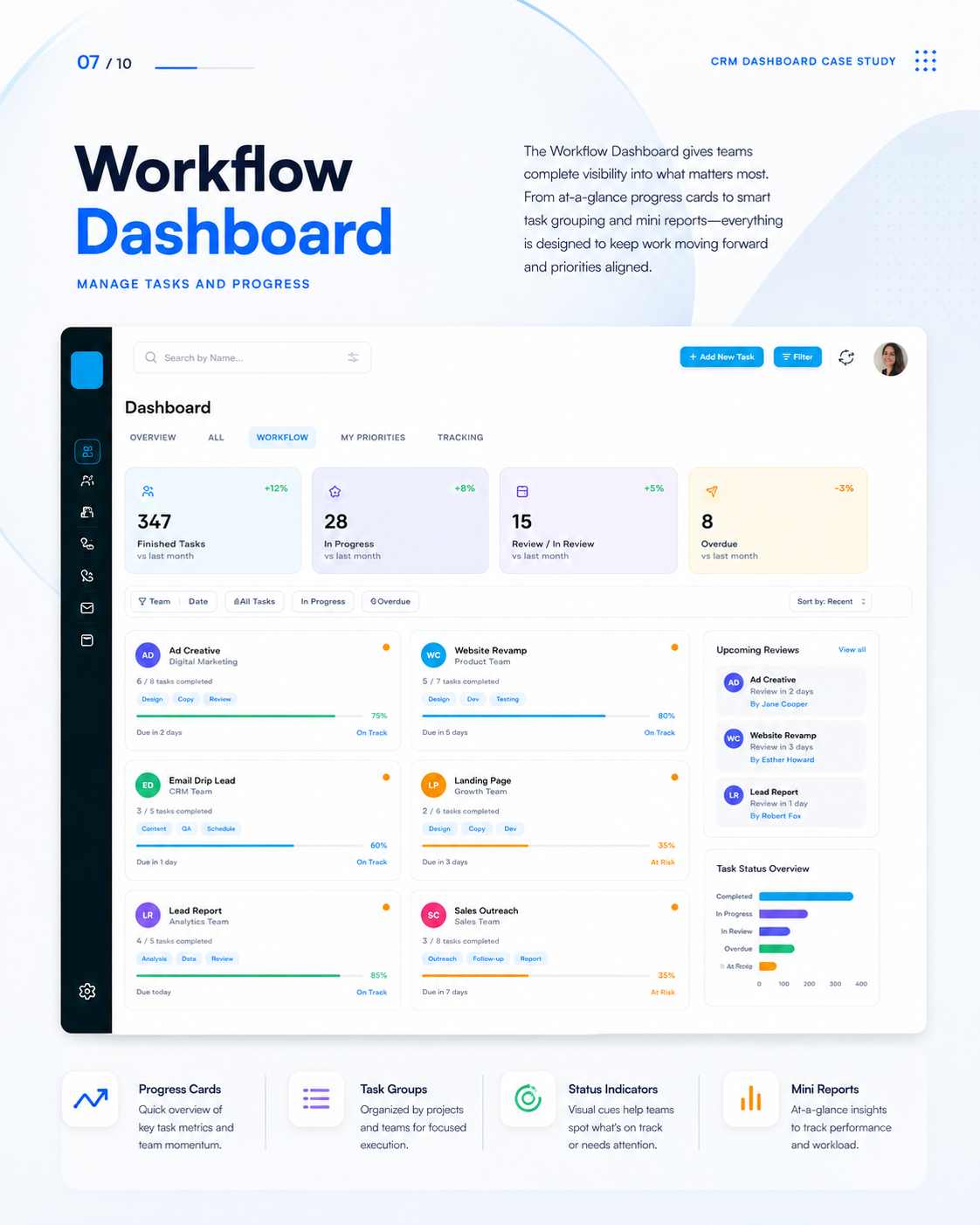
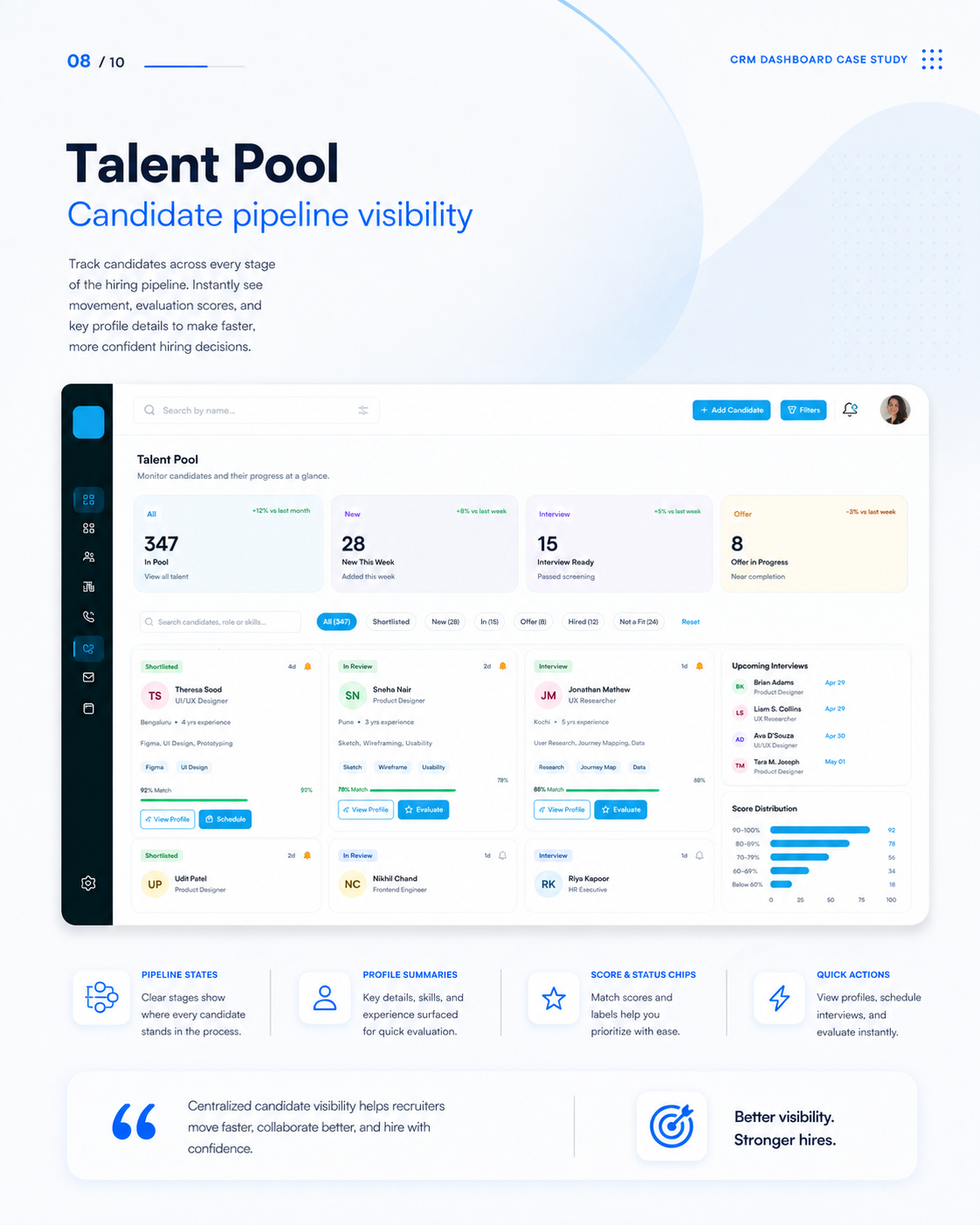
Usability Validation & Iteration
5 sales account executives
Small-sample usability test (n=5): all 5 participants preferred the drag-and-drop Kanban pipeline over nested modals. Concept project with no production telemetry.
Users struggled to read low-contrast metric text on dark table rows.
Adjusted design tokens to meet strict WCAG 2.2 AA contrast standards (minimum 4.5:1 ratio).
Outcome, Learnings & Next Steps
Created a modular B2B SaaS pipeline concept. Tested with 5 sales professionals for workflow clarity. This is a concept project with no production telemetry.
High-density data design requires careful balance of visual hierarchy, whitespace, and accessibility tokens.
Develop automated AI lead scoring visual indicators.